
A SaaS landing page has one job: turn a visitor into a trial user, demo request, or paying customer. Every element on the page either moves the visitor toward that action or distracts from it.
Most SaaS landing pages underperform because they try to do too much. A focused, well-structured page with a clear value proposition and a single call to action consistently outperforms a cluttered page with five different messages.
What Is Landing Page Optimization for SaaS?
Landing page optimization is the process of improving page elements to increase the percentage of visitors who take a desired action. For SaaS companies, that action is usually starting a free trial, requesting a demo, or signing up for a free plan.
Optimization involves testing and refining headlines, CTAs, layout, social proof, and page speed. Small changes to these elements can produce measurable improvements in conversion rates.
Why SaaS Landing Pages Are Different
SaaS landing pages face unique challenges compared to ecommerce or lead generation pages.
Visitors are evaluating a subscription commitment, not a one-time purchase. The perceived risk is higher because the buyer is choosing a tool they will use daily. A SaaS landing page must communicate value, reduce risk, and build trust within seconds.
According to Unbounce’s 2024 Conversion Benchmark Report, the median SaaS landing page conversion rate sits at 3.0%. Top-performing pages convert at 11.7% or higher. The gap between median and top performance represents a significant revenue opportunity.
8 Landing Page Elements That Drive SaaS Conversions
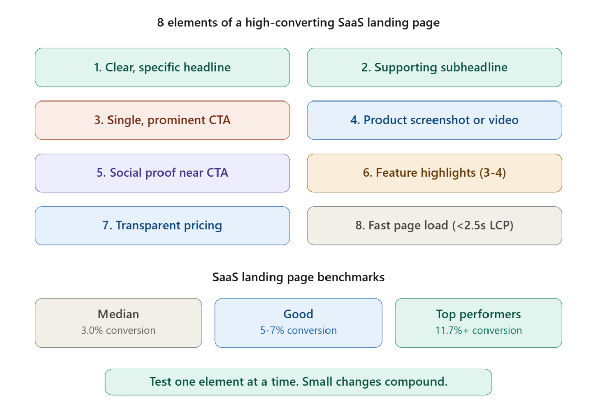
Optimizing these eight elements covers the highest-impact areas of any SaaS landing page.
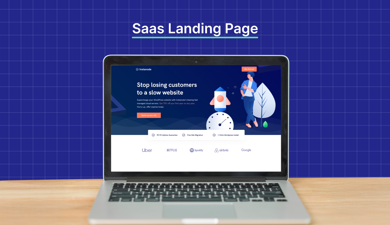
Element 1: A Clear, Specific Headline
The headline is the first thing visitors read. A strong SaaS headline communicates what the product does, who it helps, and what outcome the user can expect.
Weak headline: “The Future of Work Starts Here” Strong headline: “Project Management Software That Helps Remote Teams Ship Faster”
Specificity beats cleverness. A visitor should understand the product’s value proposition within 5 seconds of landing on the page.
Element 2: A Supporting Subheadline
The subheadline adds detail that the headline cannot fit. Use the subheadline to address the primary pain point or highlight a key differentiator.
Example: “Replace scattered spreadsheets and missed deadlines with a single workspace your whole team actually uses.”
Element 3: A Single, Prominent CTA
Every SaaS landing page needs one primary call to action. “Start Free Trial,” “Get Started Free,” or “Book a Demo” should appear above the fold and repeat further down the page.
Avoid competing CTAs. A page that offers “Start Free Trial,” “Watch a Video,” “Read the Blog,” and “Download the Whitepaper” splits attention and reduces conversion on the primary action. Studying how AI writing tools structure their signup pages shows that the strongest performers use a single, repeated CTA.
Element 4: Product Screenshots or Demo Video
SaaS buyers want to see the product before committing. A clean screenshot of the main dashboard or a 60-second demo video showing the product in action builds confidence faster than any paragraph of copy.
Place the visual above the fold or immediately below the headline section. A product image that shows a real interface is more persuasive than a generic stock illustration.
Element 5: Social Proof Near the CTA
Social proof placed close to the call to action reduces friction at the decision point. Effective social proof formats for SaaS include:
- Customer logos from recognizable brands
- Review scores from G2, Capterra, or Trustpilot
- A specific customer quote with name, title, and company
- Usage stats like “Trusted by 10,000+ teams”
One strong testimonial near the CTA button is more effective than a wall of generic praise at the bottom of the page.
Element 6: Feature Highlights, Not Feature Lists
Visitors do not read long feature lists. Highlight 3 to 4 core features, each with a short description and a visual element (icon, screenshot, or animation).
Frame each feature as a benefit. “Automated reporting” becomes “Save 5 hours per week with automated reports that build themselves.” Benefits answer the visitor’s real question: what does this product do for me?
Element 7: Transparent Pricing or a Clear Next Step
For self-serve SaaS products, displaying pricing on the landing page removes a major friction point. Show 2 to 3 plans side by side with a recommended option highlighted.
For enterprise products where pricing is custom, replace the pricing section with a clear “Talk to Sales” or “Get a Custom Quote” CTA. Never leave the visitor guessing about the next step. Reviewing how top SaaS SEO agencies present their own service pages reveals effective pricing display patterns.
Element 8: Fast Page Load Speed
A landing page that takes more than 3 seconds to load loses visitors before they read the headline. Compress images, minimize third-party scripts, and use lazy loading for below-the-fold elements.
Target a Largest Contentful Paint (LCP) under 2.5 seconds and a Cumulative Layout Shift (CLS) under 0.1. Page speed is both a ranking factor and a conversion factor.
SaaS Landing Page Layout Patterns That Work
The most effective SaaS landing pages follow a predictable structure:
- Headline + subheadline + CTA above the fold
- Product screenshot or demo video
- Three to four feature highlights with visuals
- Social proof section (logos, testimonials, review scores)
- Pricing or next-step section
- Final CTA repetition
- FAQ section addressing common objections
Following this structure does not make the page generic. The differentiation comes from the messaging, visuals, and product screenshots, not from an unusual layout. Visitors expect a familiar structure because familiar patterns reduce cognitive load.
A/B Testing for SaaS Landing Pages
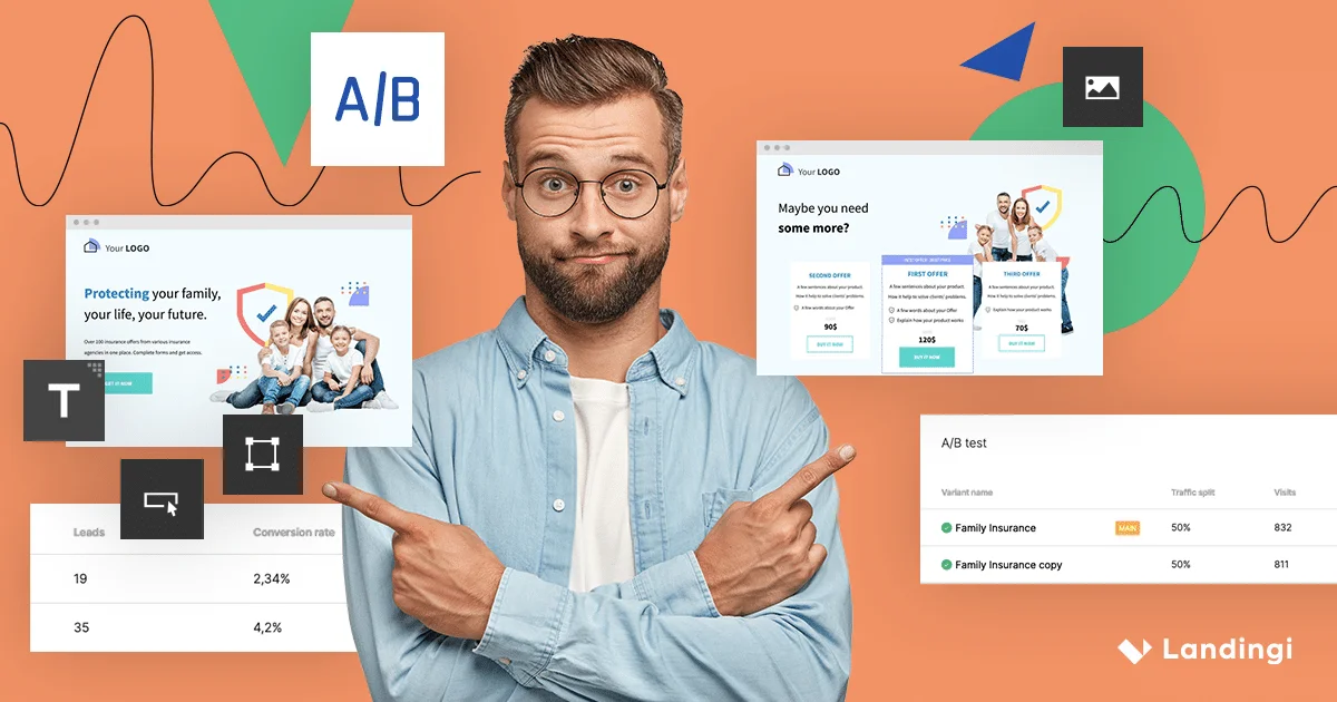
Optimization requires testing. Run A/B tests on one element at a time to isolate what drives improvement.
High-impact elements to test first:
- Headline copy (specific vs aspirational)
- CTA button text (“Start Free Trial” vs “Get Started Free”)
- CTA button color and size
- Social proof placement (above fold vs below features)
- Pricing display (show pricing vs hide behind “Contact Sales”)
Run each test for at least 2 weeks or until statistical significance is reached. Avoid drawing conclusions from small sample sizes. Working with B2B marketing agencies that specialize in conversion rate optimization can accelerate the testing process.
Start Converting More Visitors Today
A SaaS landing page does not need to be perfect on day one. Launching with a clear headline, a single CTA, a product screenshot, and social proof near the button covers the fundamentals. Test, measure, and iterate from there. Every percentage point of conversion improvement compounds into revenue over time.
Share your landing page URL in the comments for feedback, or explore our guide to content creation services for help building high-converting page copy.
Frequently Asked Questions
What is a good conversion rate for a SaaS landing page?
The median SaaS landing page converts at about 3%. Top-performing pages convert at 10% or higher. Conversion rate depends on traffic source, product type, and page optimization.
Should SaaS landing pages show pricing?
Self-serve products benefit from transparent pricing on the landing page. Enterprise products with custom pricing should display a clear “Talk to Sales” CTA instead.
How many CTAs should a SaaS landing page have?
One primary CTA repeated 2 to 3 times throughout the page. Avoid competing calls to action that split visitor attention.
What is the most important element on a SaaS landing page?
The headline is the most important element because it determines whether the visitor continues reading. A clear, specific headline that communicates the product’s value proposition outperforms generic or clever headlines.
How often should SaaS companies A/B test landing pages?
Run tests continuously, changing one element at a time. Prioritize high-impact elements like headline copy, CTA text, and social proof placement.
Should SaaS landing pages include a product demo video?
Yes, when possible. A 60-second demo video or product walkthrough builds confidence faster than text alone. Place the video above the fold or immediately after the headline.